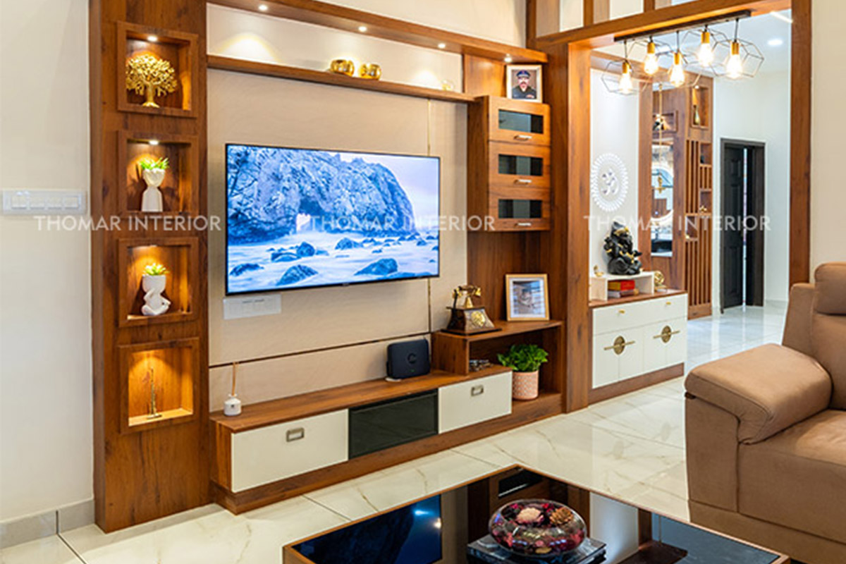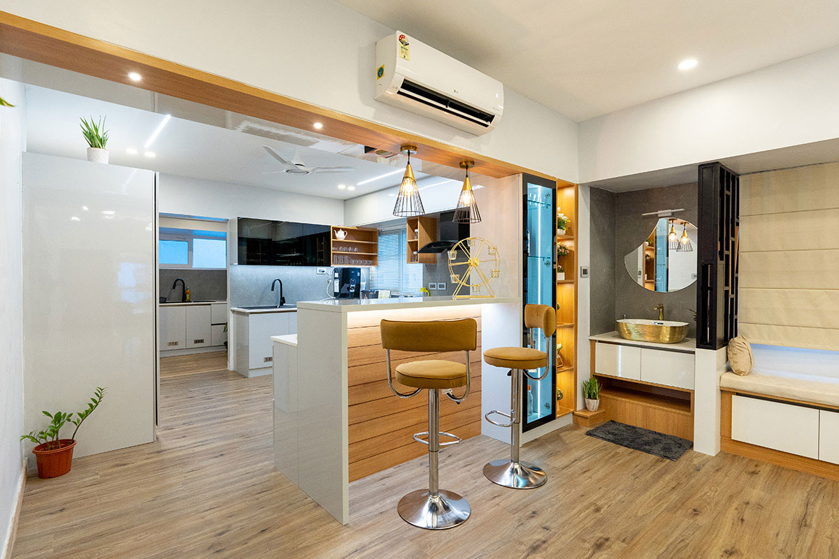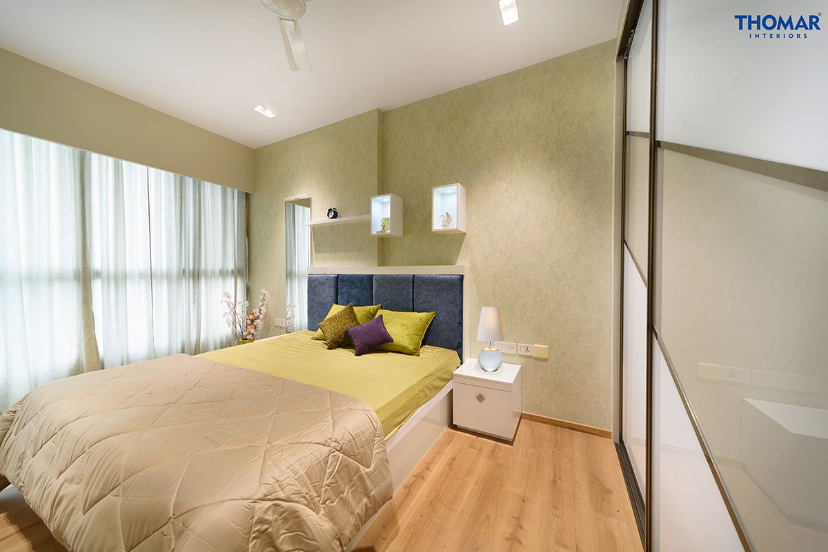
Colour has a deep impact on our emotions and behaviours. They are crucial to affect our mood whether at home or office. Interior designers use Colour psychology to create spaces that look appealing and promote well-being. This blog explores how different hues affect mood and atmosphere in design aesthetics.
Importance of colour in interior design
Understanding the language of colour is very fundamental in interior design. It enables designers to build spaces that evoke desired emotions and enhance functionality of that particular area. Each colour has its own symbolic as well as emotional relations. And this connectivity influences our perceptions and feelings. Designers can transform interiors to desired mood and preferences of client by wisely selecting colours based on the function of the specific space.
Colour selection and perception of space
Colours can make spaces appear larger or smaller. Light colours such as white and sky blue create an illusion of space whereas dark colours such as black and navy-blue can make a space feel reduced. Thus, colours can make or break the ambiance of a room. Designers can use colour psychology to create spaces that are aesthetically pleasing and promote well-being and productivity.
White
White stands for purity and simplicity. It creates a sense of calmness and spaciousness. Pairing white colour with other accent colours also create specific feelings. Interior designers often make use of this in modern home décor for making rooms appear larger, brighter and mood specific.
Red
Red is an energetic colour that evokes passion and excitement. It can add warmth and depth and is ideal for living and dining rooms. The best practice is to use it sparingly or balanced with other colours as too much too much red can be overwhelming.
Blue
Blue is a popular choice for bedrooms and bathrooms as it is known for its calming and soothing effects. Light shades of blue can make a space feel open and airy while darker shades create a cozy and intimate atmosphere.
Green
Green is associated with nature and it brings balance and harmony into a place. it is also ideal in eco-friendly designs to highlight sustainability. Lighter shades of green are perfect for bedrooms and living rooms. Darker shades work well in dining rooms and kitchens.
Yellow
Yellow conveys cheerfulness and positivity. It is mostly used to enhance children’s rooms and play areas due to its playful nature. Yellow is also used in kitchens and dining rooms as it creates a welcoming atmosphere.
Purple
Purple adds a touch of luxury and sophistication to any room. It is commonly used in bedrooms and bathrooms for a calming effect. Lighter shades like lavender create a romantic ambiance and darker hues like plum bring elegance.
Orange
Orange is an energetic colour that brings warmth and enthusiasm. It can also stimulate creativity and is a good choice for home offices. Orange is great for living rooms and family spaces to encourage a lively atmosphere.
Black
Black is powerful and t adds depth when used as an prime colour. It is used in modern interior styling to create an elegant look. Black is best balanced with lighter tones as too much black can make a room feel oppressive.
Grey
Grey is a neutral colour that offers versatility and sophistication. It serves as an excellent base colour scheme in interior design. Lighter greys create a peaceful atmosphere while darker shades add moodiness.Even though, colour psychology is essential to interior design for shaping moods and behaviours within a space, from furniture design to space planning every element contributes to the overall harmony and functionality of the home.